It’s week 4 of isolation. … anyone else fighting the urge to put up your shutters? Do you long to grab a cup a joe and plow through some spaghetti models? This week, the buzz around COVID-19 data is about the accuracy of projection models. I’m thinking that for hurricane experienced Floridians, it all feels familiar; only different.
Now, if you’re COVID-19 data weary or your eyes glaze over at the sight of an infographic, you may want to skip this article. For rest of us, onward. Using data we culled from the state and county, here’s some visuals we found helpful for understanding what’s going on locally. YMMV.
BocaFirst will update this information daily on our COVID-19 Tracker. For tips on developing a care plan for your family, see the BocaFirst article A Nurse’s Guide to Managing Your Health During COVID-19.
Data in this article is provisional and subject to change.
First, a quick detour on visualizations. While there’s no shortage of COVID-19 data, poor math and analytical skills abound. Especially on social media. For example, much was made of the US death count surpassing other countries. But did you know when adjusted for country size, the US ranks 19th in terms of the percentage of the population that died from COVID-19? The graphics in this article are meant to help honestly and factually see what’s happening locally. Data in this article is provisional and subject to change.

Boca has the most cases in the County
When tallied by zip code, Boca Raton has the most total confirmed cases (by city) in Palm Beach County. When the cumulative number of daily cases is plotted in a square for social media, it looks alarming. But if you increase the x-axis and give the counts some headroom in the y-axis, it’s much different.

Comparisons and trends give insight. Below is the same cumulative case data for the top two infected cities in the county plotted as bar graphs with a trend line. The trend will flatten as the virus plays out.
NOTE: Case count results may be the result of testing and not accurate in terms of actual number of virus cases in each county. Palm Beach County May be doing a better job of people being able and wanting to get tested.

Palm Beach County COVID-19 data
The cumulative case count for the 25 most affected cities in Palm Beach County is shown in a bar chart as the featured image of this article. Some cities are listed twice in the data because that is how they are reported in the data. The bar graph shows the absolute number of cases in each city from most impacted to least. The pie chart below shows the same data as percentages of the whole. This reveals that neighboring cities West Palm, Boynton and Delray have similar sized cumulative case counts. While the first testing station was centrally located in the county (WPB), it makes sense the second county testing station was located in West Delray.


Neighboring Broward and Dade County metro areas are COVID-19 hotspots. Here’s a comparison of the cumulative cases in the three counties.

What about testing?
At the state level, daily testing has gone from 384 on March 19 to 11,343 as of April 6 2020. According to the data, the percentage of positive tests took a recent dip. With the April 6 opening of the south county testing lab, the absolute numbers are expected to jump. The percentage positive is one of the numbers scientists track. Here is the number of tests performed in parallel with the percentage of positive results.

Deaths
Lacking daily historical data on deaths for Palm Beach County, we constructed a partial data plot by harvesting news reports. However we lack reports for some days. If you have a source for the missing dates, contact us. In the meantime we are tracking it going forward. Bear in mind, deaths lag 2-3 weeks from the time of infection.

If you’re bleary-eyed from the national spaghetti charts that have Florida mixed in a pile of other states at the bottom, here’s a comparison of the daily death rate of New York State, Florida, and Louisiana.

What about the rate of new cases?
Like the cumulative case counts, the number of new cases will go up with increased testing in PBC. They also may go up due to new cases that were seeded from the influx of those fleeing the lockdowns two weeks ago in other hotspots. However, new cases are offset by how well residents complied with the “Slow the Spread” guidelines. Compliance with those guidelines may vary with population age and culture. Since the counties and cities implemented the guidelines at different times, comparing new cases between counties may show the effects of the dynamic between seeding and Slow the Spread compliance. Bear in mind, new cases reflect infection spread from two weeks ago. According to the science, when the new case trend turns downward, the virus infection curve is being flattened.

You can only go from where you are
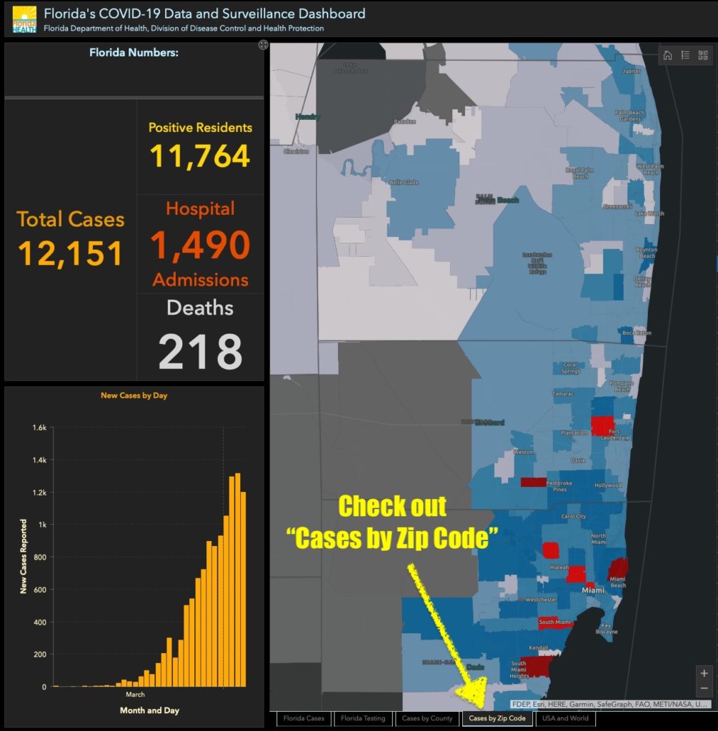
If you aren’t COVID-19 data weary yet, The Florida Department of Health has a web page that lets you explore current data in various ways. It’s updated twice a day. Click the screen shot below to go there and select the “Cases by Zipcode” tab along the bottom. The BocaFirst COVID-19 Tracker is designed to help distill trends in the local area as they occur. As is repeated often by Dr Fauci, the cases we’re measuring now reflect infections that happened 14 days ago. The deaths we experience lag a few days more. At week 4 since Boca Raton implemented Stay Home/Stay Safe, the trends we’ve been able to distill in these graphics will hopefully show the fruits of those efforts.
Contributors to this article: Jim Wood